Which looks better? 6
-
The first one (3) 50%
-
The second one (3) 50%
-
They are both terrible (0) 0%
-
They are both equally good (0) 0%
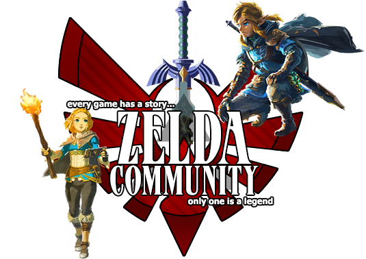
Ok, I made two new sigs to go with my name. Here is the first:

I made this one using a quick tutorial. I guess it's alright.
For my second one I also used a tutorial that you may recognize:

Comments on both please..

