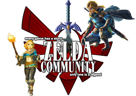
I made this when I started working with GIMP and got better.

Not the best one I've made, but I think its good.
I made this when I started working with GIMP and got better.

Not the best one I've made, but I think its good.
Whoah! Thats great! I love it.
Thanks!
It is simplistic, but the text is quite plain.
Pretty cool, I like it
why would a color make someone look fatter?
why would a color make someone look fatter?
its a joke genious.
its a joke genious.
Ok settle you too. I'm sure mort knew it was a joke. Please no fights.
Ok settle you too. I'm sure mort knew it was a joke. Please no fights.
Huh? There is no hostility here.
Secondly, that wasn't a joke, but it was the antithesis what she was aiming for - darker colors like black can actually make you look thinner, whereas lighter colors such as white can be more revealing. Hence why I do not like wearing white shirts.
Huh? There is no hostility here.Secondly, that wasn't a joke, but it was the antithesis what she was aiming for - darker colors like black can actually make you look thinner, whereas lighter colors such as white can be more revealing. Hence why I do not like wearing white shirts.
Is that right. I've never noticed that before... I'll have to keep an eye on it.
As for the sig, nicely done... Simple, yet sufficient... though the text itself could have used a little more flavor to the mix.
It's good when you take consideration of what you can and can't do when you start with GIMP. So, Nice Job ![]()
Thanks guys. ^_^
Pretty cool ![]()

